Behind the Brand: Heart Magazine
From its earliest vision, Heart was never just a magazine. It was a lifestyle brand built on authenticity, connection, and storytelling that felt real. We were there from the very beginning — hand-drawing logos, curating content, and shaping the identity that would give Heart its staying power.

The name Heart wasn’t chosen lightly. Its founder was inspired after her son was born with a congenital heart condition — an experience that reshaped her perspective and reminded her to pursue the things she had always dreamed of. The magazine became part of that promise: to create something meaningful, authentic, and lasting.
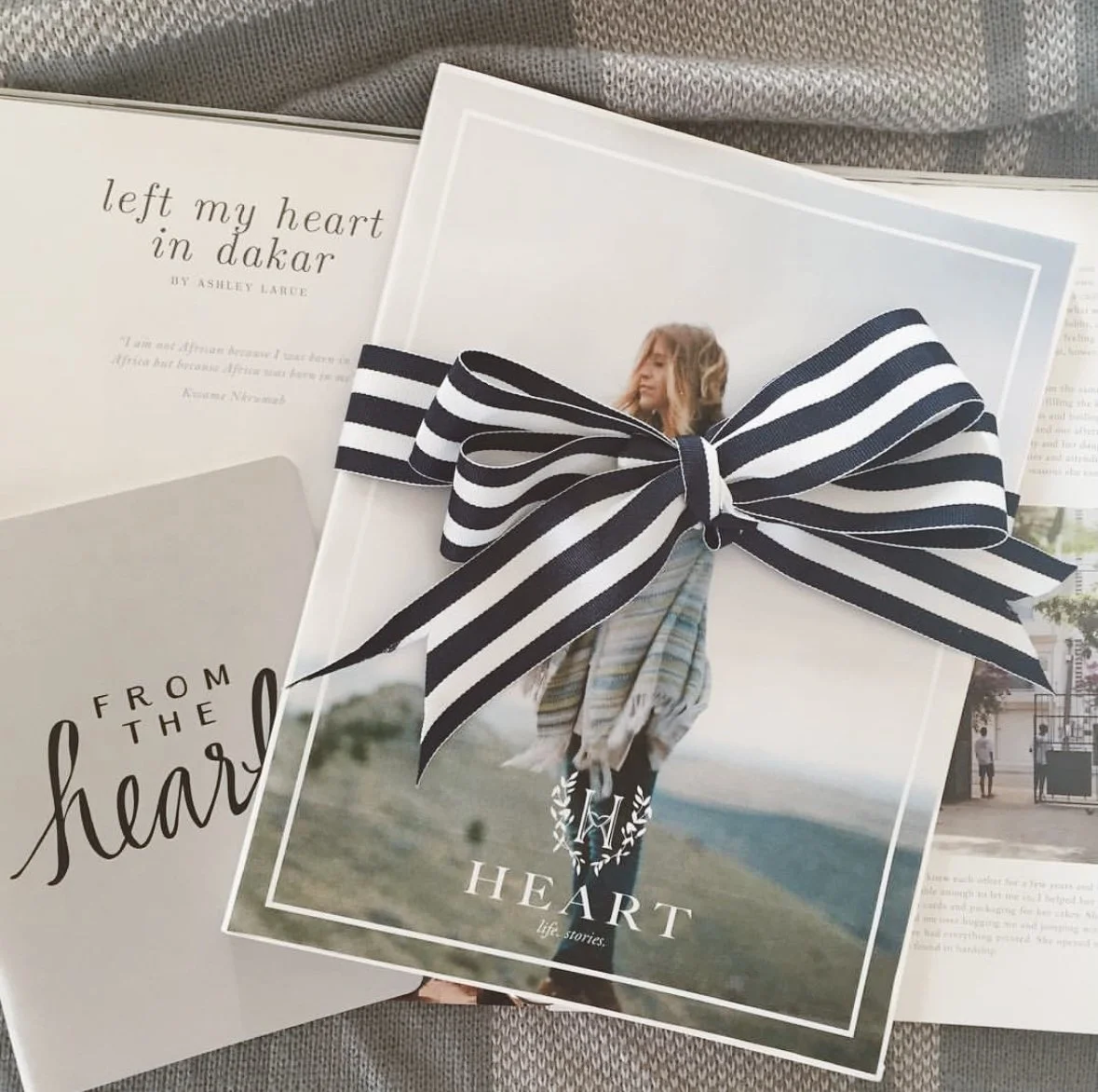
We drew inspiration from everyday women, honest photography, and the timeless appeal of simple, human-centered design. Heart needed to feel approachable and modern, but also built to last.
That spirit carried into every design and editorial choice:
Color Palette → Blue and green, grounding tones that conveyed calm, growth, and life — a deliberate departure from glossy fashion-mag pinks or overproduced palettes.
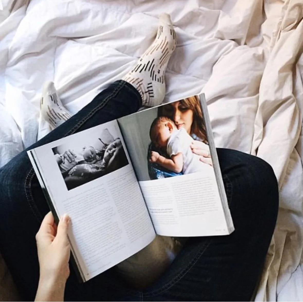
Editorial Voice → Stories were chosen to reflect a wide spectrum of women, appealing across ages, backgrounds, and demographics. Each issue created a sense of belonging, not exclusivity.
Photography → Prioritizing real, honest imagery over heavy Photoshop, reinforcing the belief that beauty lies in authenticity.
At its core, Heart was a response to what women were craving: something real in a world of filters and gloss.


“Heart was way more than a magazine, it was a movement.”
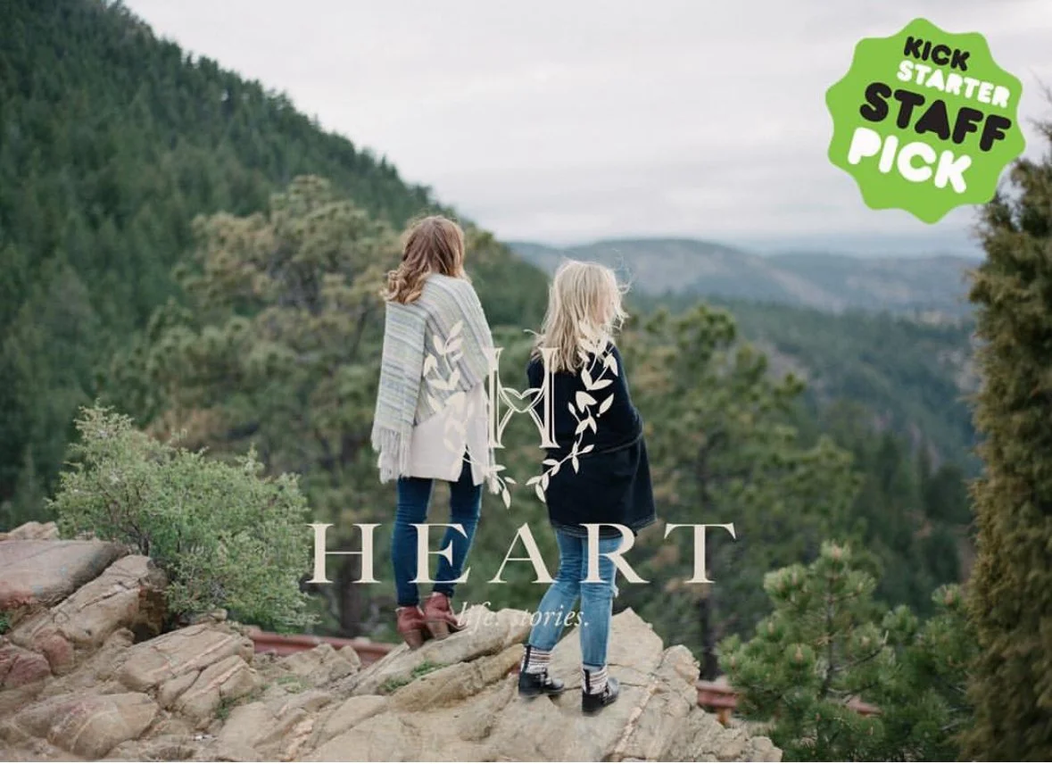
Our role went far beyond design — from launching a Kickstarter campaign to assembling a global team of writers and photographers, every step shaped Heart into something more than print: a lifestyle brand.
The launch created an almost cult-following of women looking for something different and real in their media consumption. Heart’s design system gave it the flexibility to expand into events, digital storytelling, and beyond - always true to its roots.