
Behind the Brand: Love, Lauren Art
A joyful, heartfelt identity for an artist who sees the world in pinks, patterns, and possibility.
Some brands are built on strategy. Others, on heart. Love, Lauren began as both — a reflection of an artist whose world is filled with color, kindness, and creativity. Between her work as a school nurse and her studio practice, Lauren’s joy is contagious. She paints the world she wants to see: bright, personal, and full of love.

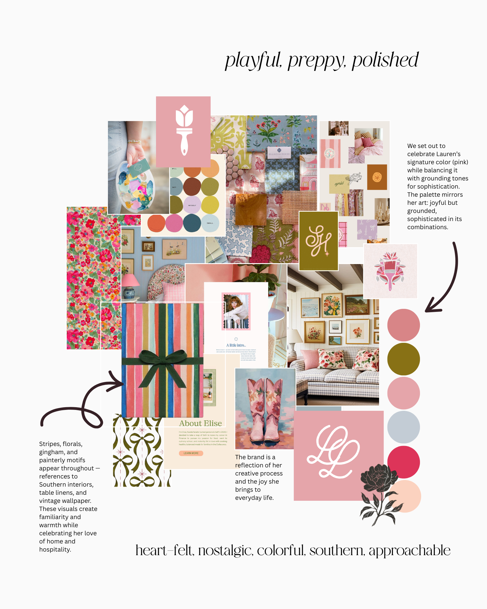
The name “Love, Lauren” came naturally — each piece she creates feels like a handwritten note from the heart. The brand draws on her signature color, pink, and mixes nostalgic patterns with cheerful tones. It’s Southern charm meets modern creativity — equal parts sentiment and sunshine.
The tulip mark and monogram reflect the artist herself — feminine, grounded, and full of life. The rounded letterforms and organic curves were designed to echo the brushstrokes in her paintings and the softness of her color palette.
Color Palette → pink, coral, moss, and sky — joyful yet balanced.
Typography → A mix of elegant serif and playful script mirror her painterly vibe.
Patterns → Florals, stripes, and gingham evoke nostalgia and joy.
Textures → Touches of linen, paper grain, and ribbon to ground the brand in tactility.


“The brand needed to feel like a letter to a loved one — personal, beautiful, and a little bit whimsical too.”

The design process mirrored Lauren’s art-making — full of story, experimentation, and joyful imperfection. Each detail was hand-considered to make the brand feel like an extension of her creative life.
The finished brand captures the essence of Love, Lauren: approachable, playful, polished. It reflects a love of color, her Southern spirit, and her belief that creativity — like kindness— should be shared freely.
Every brand tells a story. Lauren’s just happens to be written in color.
