

Behind the Brand: Love, Lauren Art
joyful, heartfelt Fort Worth artist who sees the world of southern art with pink, pattern, and possibility.
A joyful, heartfelt identity for an artist who sees the world in pinks, patterns, and possibility.
Some brands are built on strategy. Others, on heart. Love, Lauren began as both — a reflection of an artist whose world is filled with color, kindness, and creativity. Between her work as a school nurse and her studio practice, Lauren’s joy is contagious. She paints the world she wants to see: bright, personal, and full of love.

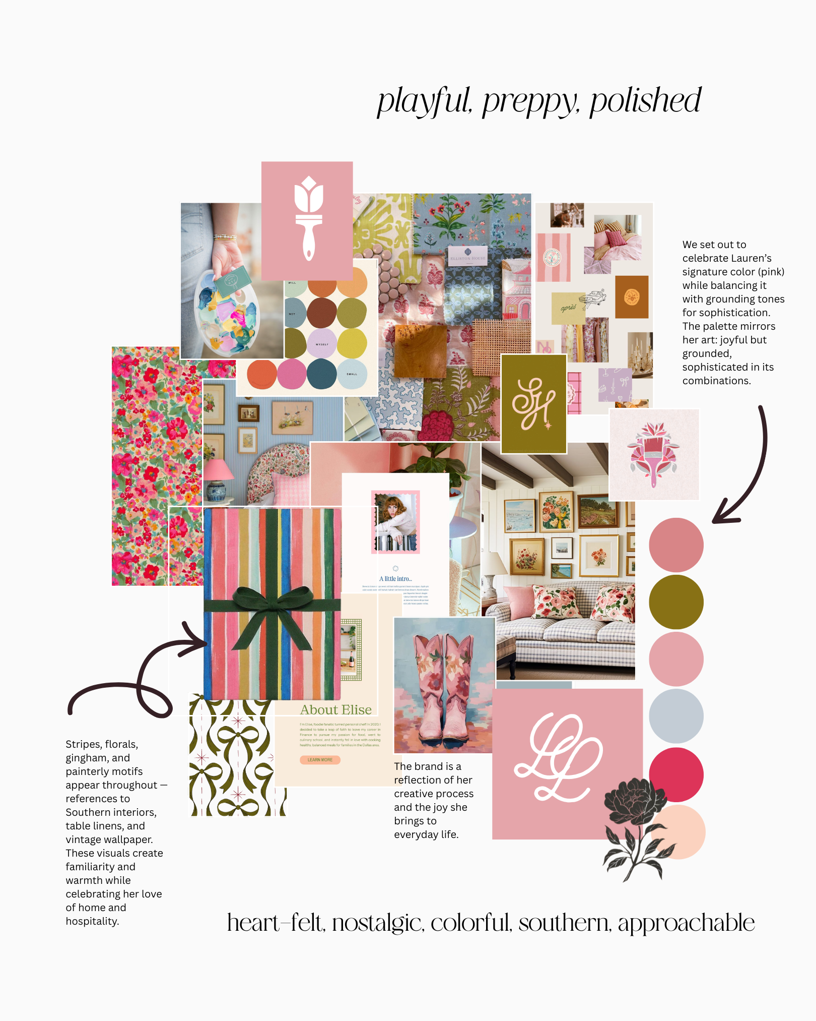
The name “Love, Lauren” came naturally — each piece she creates feels like a handwritten note from the heart. The brand draws on her signature color, pink, and mixes nostalgic patterns with cheerful tones. It’s Southern charm meets modern creativity — equal parts sentiment and sunshine.
The tulip mark and monogram reflect the artist herself — feminine, grounded, and full of life. The rounded letterforms and organic curves were designed to echo the brushstrokes in her paintings and the softness of her color palette.
Color Palette → pink, coral, moss, and sky — joyful yet balanced.
Typography → A mix of elegant serif and playful script mirror her painterly vibe.
Patterns → Florals, stripes, and gingham evoke nostalgia and joy.
Textures → Touches of linen, paper grain, and ribbon to ground the brand in tactility.


“The brand needed to feel like a letter to a loved one — personal, beautiful, and a little bit whimsical too.”

The design process mirrored Lauren’s art-making — full of story, experimentation, and joyful imperfection. Each detail was hand-considered to make the brand feel like an extension of her creative life.
The finished brand captures the essence of Love, Lauren: approachable, playful, polished. It reflects a love of color, her Southern spirit, and her belief that creativity — like kindness— should be shared freely.
Every brand tells a story. Lauren’s just happens to be written in color.


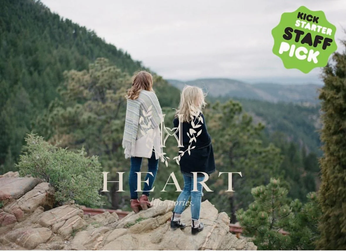
Behind the Brand: Heart Magazine
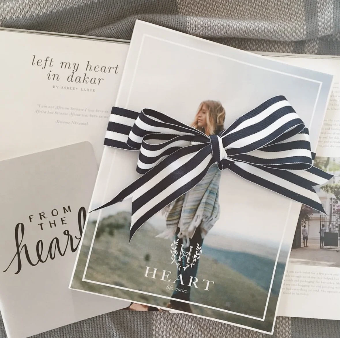
From its earliest vision, Heart was never just a magazine. It was a lifestyle brand built on authenticity, connection, and storytelling that felt real. We were there from the very beginning — hand-drawing logos, curating content, and shaping the identity that would give Heart its staying power.
From its earliest vision, Heart was never just a magazine. It was a lifestyle brand built on authenticity, connection, and storytelling that felt real. We were there from the very beginning — hand-drawing logos, curating content, and shaping the identity that would give Heart its staying power.

The name Heart wasn’t chosen lightly. Its founder was inspired after her son was born with a congenital heart condition — an experience that reshaped her perspective and reminded her to pursue the things she had always dreamed of. The magazine became part of that promise: to create something meaningful, authentic, and lasting.
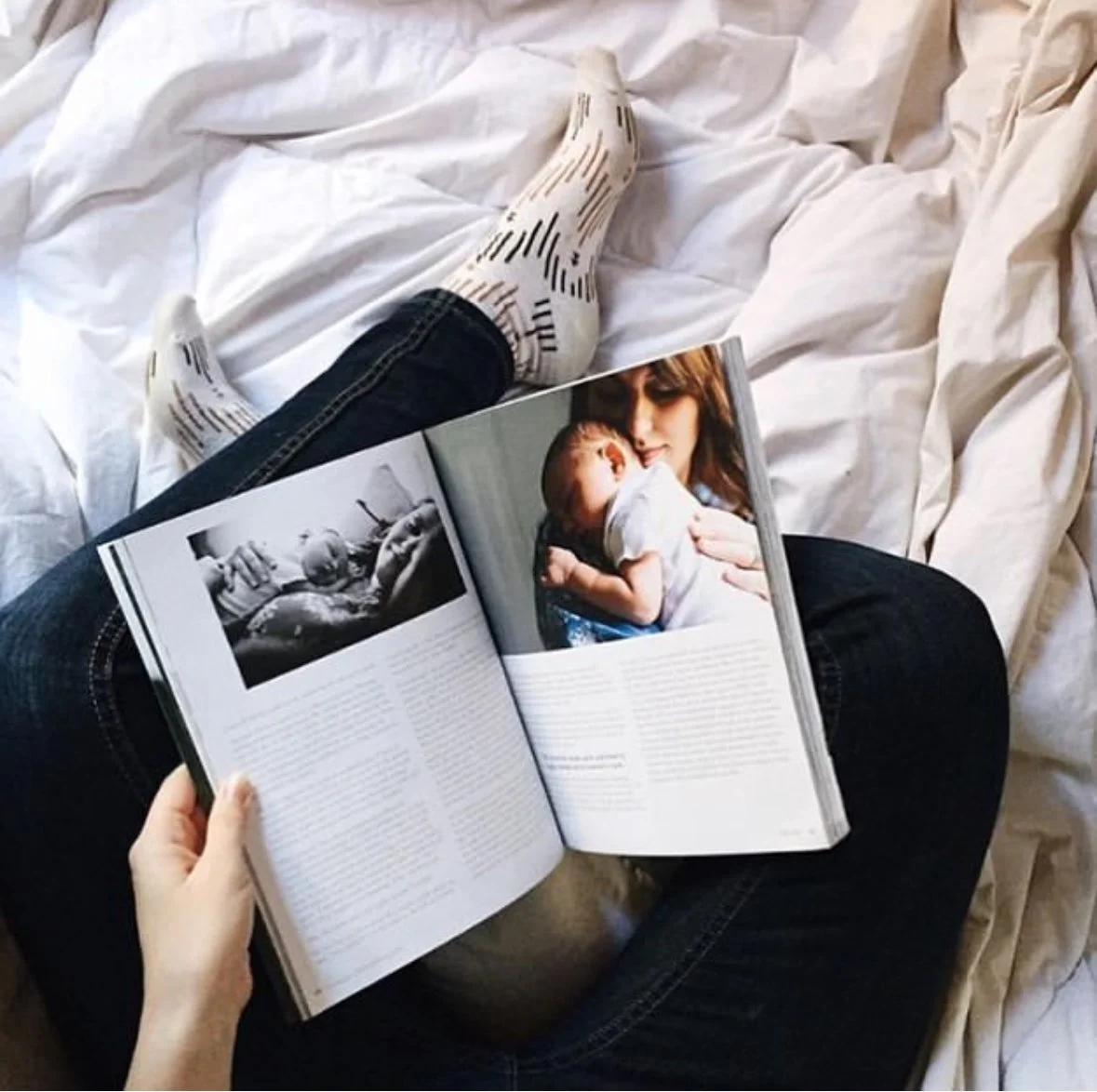
We drew inspiration from everyday women, honest photography, and the timeless appeal of simple, human-centered design. Heart needed to feel approachable and modern, but also built to last.
That spirit carried into every design and editorial choice:
Color Palette → Blue and green, grounding tones that conveyed calm, growth, and life — a deliberate departure from glossy fashion-mag pinks or overproduced palettes.
Editorial Voice → Stories were chosen to reflect a wide spectrum of women, appealing across ages, backgrounds, and demographics. Each issue created a sense of belonging, not exclusivity.
Photography → Prioritizing real, honest imagery over heavy Photoshop, reinforcing the belief that beauty lies in authenticity.
At its core, Heart was a response to what women were craving: something real in a world of filters and gloss.


“Heart was way more than a magazine, it was a movement.”
Our role went far beyond design — from launching a Kickstarter campaign to assembling a global team of writers and photographers, every step shaped Heart into something more than print: a lifestyle brand.
The launch created an almost cult-following of women looking for something different and real in their media consumption. Heart’s design system gave it the flexibility to expand into events, digital storytelling, and beyond - always true to its roots.

Behind the Brand: Embellish Mountain Weddings
When Embellish came to us, they were known as Embellish Productions — a name and look rooted in trends but unclear about who they served. With glitter and pink visuals, they struggled to attract the high-end Jackson Hole clientele they dreamed of. Our challenge was to transform them from “on-trend” to aspirational, timeless, and impossible to overlook.
When Embellish came to us, they were known as Embellish Productions — a name and look rooted in trends but unclear about who they served. With glitter and pink visuals, they struggled to attract the high-end Jackson Hole clientele they dreamed of. Our challenge was to transform them from “on-trend” to aspirational, timeless, and impossible to overlook.


We looked to elevated florals, heritage-inspired details, and the Jackson Hole landscape itself. The goal was a brand that blended luxury with authenticity — refined enough for destination brides, but rooted enough to resonate locally.
We drew from wedding trends like blush pink with a discerning eye, weaving them together with timeless elements to create a brand and portfolio designed to turn heads and endure.


““The brand needed to signal heritage, refinement, and luxury — without trying too hard.””

Each styled shoot became both a portfolio-builder and a proof of concept: showing brides, planners, and vendors exactly the caliber of event Embellish could deliver.
With a refined new name, timeless identity, and aspirational portfolio, Embellish began booking large-scale events and higher-budget brides. Their reputation shifted from trendy to timeless — aligned with the Wyoming luxury market they set out to reach.
